
Initial A-format design for the poster. Same style as my idea for the cover of the pack, which although it was a typical "me" - first idea and run with it - the style suits my work and i want to transfer this across to create the series.
The above design doesn't really work as a layout for photos. the red boxes take too much away from each image when used as a border. It makes more sense if certain boxes are replaced by photos. Also i though the grid needed regimenting a bit.
I designed the above with the actual layout in mind. Each of the three rows have two columns with two portrait rectangles to represent images, with titles underneath. On the other spread, there is a title space and a box for two columns of text. I want to try to stay away from the dread A-format though i think. Just doesn't seem to interesting.
Aha! Half a portrait A2 sheet using the same layout idea as above. Basically just DPS's stacked on top of each other. I really like the idea of unusual formats, besides, it means i get two posters from each print this way.


 Initial A-format design for the poster. Same style as my idea for the cover of the pack, which although it was a typical "me" - first idea and run with it - the style suits my work and i want to transfer this across to create the series.


 Consistent layout, i plan to be in series throughout the pack. I'm not sure about the layout of the book and magazine covers. They seem to create a big space on the right hand page that looked ok on screen. I do like the big quotes going across though. This is why i chose to keep the pictures as they were.

 Two colour screen print on this calvinball record was designed by Joe Lawrence. The interview goes into detail about process and other design decisions. Really sweet texture of the ink but the offset monoprints in two colours kind of ruins the clarity of the text which is a shame. The layout is consistent in the series - two columns with right aligned small print.
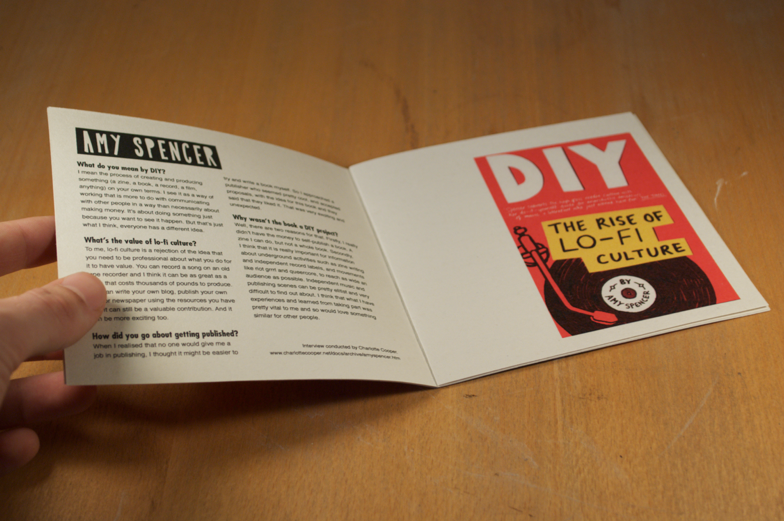
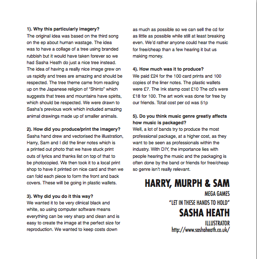 Mega Games' new EP. Tree illustration by sasha heath. Pretty cool drawing : ) same layout for interview.
 Stencil design by Joe Towns of Glaciers for their debut EP.


 7 inch pulpboard case, I designed and cut this out myself. Holds everything together very nicely. Will have a lovely screen print designed to cover both the front and back of the case.
 Flaps to contain contents in the case (screen printed side down in this image).
 Full contents!