Tuesday, 1 December 2009

THE POWER OF PAPER (745.2)

I LIKE PAPER STOCKS. these business cards are sweet as my nuts.

Corporate branding developed from the idea of trying to develop corporate branding! its all designed and printed to look hand drawn, complete with "call for a good time" style match box business cards and individually scribbled red pen for effect. ah lav eet.

Concertina books are cool. that's all there is to it. This one has embossed covers and weird dada style typography. its actually a christmas card. pretty cool. Except the eye in my. thats just shit.

FOLDERS AND ENVELOPES (745.2)

This books from the library. It has lots of commercial promo pack type things, which is exactly the kind of thing i want to do for my resistance packaging. I like all the different ways of rounded cornerproducing the same thing.

oooh, slots on the inside! folds on the outside mean no slippage!

folds and slices make pockets! nice visuals. I really like the idea of these promo pack things. they are sweet.

S'all chilean and that. i like the colour schemes and the matteness of it all.

lovely rounded corners and fantastic andy colours. dinnar why that blues there tho.

Things to do in leeds!

aww its a little A6 book/zine giving you things to do in leeds! shame it has that fucking starburst on it.

i like the cover stock, it looks recycled and has a good hearty texture to it. woof.

centrefold has a map with a key! what more could you ask for??

Monday, 23 November 2009

Philippa Rice - 100 Things To do

Black monoprint only. High quality copying tho! I really like the concept, cos i get bored a lot. I will keep this handy from now on.

There's a lot of layout experimenting in this. Quaint line illustrations that do look a little rushed in places, but thats half the charm.

Kristyna Bacynski - A Four Panel Affair

Aww, its iddy biddy and cheap.

Cute little illustrations in a four panel layout in a variety of colour schemes giving each one differentiation.

straight up cut out and fold up arrangement. looks cool when unfolded as well tho!

Filthy Little Angels Records

This is taken from the fla website. check the strangeways font haha.

Very simple monoprint image on brown CD case. Photograph doesnt transfer to mono very easily, looks a bit bitty for my liking.

Again, nice and simple. Centralised text for track listing with small print and fla logo.

I really love this artwork. Its a really nice illustration that i think is a bit too twee when compared to the music. The stock is much better than that the above example but darker, could be contrast issues with the ink.

Very illustrative for the back of a CD. Tracks are in small print above the label logo.

Ahh, a full Jewel case CMYK from the label.

Apparently this was an earlier release than the simple monoprinted card cases above. A lot more money was splashed out on duplication and printing. That pink says it all really.

The label decided to change to the cheaper printing methods after a while. Loki Machine, however, are aiming cheap as chips from the start.

Curtis and Terrorist - Modern Monstrosity Comics

The Curtis and Terrorist page on the Modern Monstrosity Comics website.

Hamd drawn front cover of issue 1. Looks like sharpy and highlighter on reformed cardboard, Rock and roll.

More hand drawn text on the inside cover.
6 panel A4 fold up zine stapled inside. CMYK print on glossy paper.

Issue 2 cover! Comes in a variety of stock colours. I love the front flap!

Aww look at how scared of terrorists he is.

Same arrangement inside as issue 1, 6 panel A4 sheet folded up and stapled in. Works really well.

Wednesday, 4 November 2009

Resistance style? - pictograms!

these are interesting, not sure about the background for each image tho. it makes me think of guess who and you subconsciously look at every single one and say what it represents in your head. stick man style!
No stick men here unfortunately. Interesting combination of line drawings and silhouettes. I like the idea of having lots of illustrations for people to suss out at the same time.

Monday, 26 October 2009

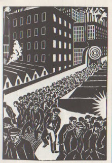
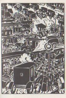
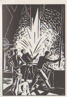
Woodcuts by Masereel

I love these woodcuts. they're from a book called "the city" and work as a social commentary of city life in the mid 1920's.
  • The first motorcars and the first awareness of pollution in city atmospheres
  • proletarian icons are also used, which suggests early sovietism
  • The wealth divide and homelessness
  • fear created by occurances such as murder
  • Mundaneness of a working class and possibly soviet lifestyle.
The style of the illustrations themselves is of great appeal to me. the monotone stamp effect is something i've been interested in for a while but never really experimented with.

Monoprinting this week?

Tuesday, 20 October 2009

London graphics

Awesome type-as-image book cover we saw in London when on a dissertation visit. About london bands and Roughtrade history.

Really nice polaroid wall in Roughtrade. Pretty classic but everyone loves polaroids.

I saw this carried out a few times in London. Just a very interesting hands-on approach to communicating a message.

"The Devil wears prada, but the People wear £5 plimsoles." Made me laugh. A D.I.Y advert.

I dont know how lush the soup actually was, but it seemed a very confident cockney advertisement that i'm pretty sure that the soup would indeed have been lush.

Expensive like. Liking the veggie one being cheaper too, ha!

Thursday, 15 October 2009

Record Label Websites!

I really like the subdued clinical feel to Household Names' site. Except in the banner, thats where all the jazziness is! its a good idea, keeps everything in the same sort of series.

I really dont like the busyness of the Fat Wreck Chords site. Horrible colours and it just seems like too much information in too many places at once.

Discord has a similar feel to the Household Name site. I like the filafax sort of feel to the posts and the banner of photos under the headline banner, which, like Household Name, has illustrations in. It includes the Minor Threat sheep as well.
The page does have a split in half feel tho, imagery at the top, text on the bottom.

Bombed Out seems like a myspace page. The stoney colours are cool tho. It seems very clinical for a punk label, but i think it works well. The stamp logo is cool.


A good clinical/punk balance. This is what i wanna aim for. Maybe with different colours or a more hands on style.

Monday, 12 October 2009

LONDON MUSIC GRAPHICS - Abstract Noun


LONDON MUSIC GRAPHICS - Roundhouse, Camden


This is a bit less punk. Full colour A3 print, once again folded to A6. Its much more form over function in comparison to the Vic one and i'd go as far as saying its too brash and "nu-rave" for my liking. The lack of layout of the cover/poster side of the print makes the photos hard to see. This is obviously a design decision but its a pretty bad one. The huge amounts of C, M, Y and K make it obvious that it would be hugely expensive to prints these in comparison to The Vic.