Monday, 26 October 2009

Woodcuts by Masereel

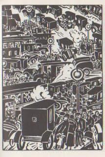
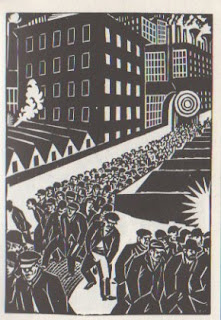
I love these woodcuts. they're from a book called "the city" and work as a social commentary of city life in the mid 1920's.
  • The first motorcars and the first awareness of pollution in city atmospheres
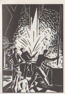
  • proletarian icons are also used, which suggests early sovietism
  • The wealth divide and homelessness
  • fear created by occurances such as murder
  • Mundaneness of a working class and possibly soviet lifestyle.
The style of the illustrations themselves is of great appeal to me. the monotone stamp effect is something i've been interested in for a while but never really experimented with.

Monoprinting this week?
Tuesday, 20 October 2009

London graphics

Awesome type-as-image book cover we saw in London when on a dissertation visit. About london bands and Roughtrade history.

Really nice polaroid wall in Roughtrade. Pretty classic but everyone loves polaroids.

I saw this carried out a few times in London. Just a very interesting hands-on approach to communicating a message.

"The Devil wears prada, but the People wear £5 plimsoles." Made me laugh. A D.I.Y advert.

I dont know how lush the soup actually was, but it seemed a very confident cockney advertisement that i'm pretty sure that the soup would indeed have been lush.

Expensive like. Liking the veggie one being cheaper too, ha!

Thursday, 15 October 2009

Record Label Websites!

I really like the subdued clinical feel to Household Names' site. Except in the banner, thats where all the jazziness is! its a good idea, keeps everything in the same sort of series.

I really dont like the busyness of the Fat Wreck Chords site. Horrible colours and it just seems like too much information in too many places at once.

Discord has a similar feel to the Household Name site. I like the filafax sort of feel to the posts and the banner of photos under the headline banner, which, like Household Name, has illustrations in. It includes the Minor Threat sheep as well.
The page does have a split in half feel tho, imagery at the top, text on the bottom.

Bombed Out seems like a myspace page. The stoney colours are cool tho. It seems very clinical for a punk label, but i think it works well. The stamp logo is cool.


A good clinical/punk balance. This is what i wanna aim for. Maybe with different colours or a more hands on style.

Monday, 12 October 2009

LONDON MUSIC GRAPHICS - Abstract Noun


LONDON MUSIC GRAPHICS - Roundhouse, Camden


This is a bit less punk. Full colour A3 print, once again folded to A6. Its much more form over function in comparison to the Vic one and i'd go as far as saying its too brash and "nu-rave" for my liking. The lack of layout of the cover/poster side of the print makes the photos hard to see. This is obviously a design decision but its a pretty bad one. The huge amounts of C, M, Y and K make it obvious that it would be hugely expensive to prints these in comparison to The Vic.

LONDON MUSIC GRAPHICS - The Vic, listings


This is an A4 sheet folded into an A6 leaflet for events in october at the vic pub in mile end. Very standard greyscale print on coloured stock. I really like the digital type being used in conjunction with collage for layout. despite not having a strict grid, the collage definitely does follow segmentation, but mainly cos of the quartered sheet.

Thursday, 8 October 2009

Elementary!

Earth, air, fire water, then the same when upside down. Bit of a headacher. I like the E / R being the same and W / TH. Just weird, dunno how they did it.