7 inch pulpboard case, I designed and cut this out myself. Holds everything together very nicely. Will have a lovely screen print designed to cover both the front and back of the case.
Flaps to contain contents in the case (screen printed side down in this image).
Full contents!
A folded information poster (double sided with cover design) about poster design and designers that I am interested in.
Double sided sheets that show CD packaging and design, then an interview with the designer on the reverse explaining their non-mainstream approach to design for music.
Booklet that explains books based on lo-fi/DIY culture and social theory but also looks at zines and contain interviews with zinesters.
Since my work mainly covers "design for music", "design for publication" and "poster design" all with a Lo-Fi yet clinical aesthetic and a general theme of social theory and political awareness, i have chosen to produce a pack of relevant products rather than a book.
The pack will be in the format of a 7" single - more robust and substantial than my usual CD format. It will contain a selection of examples of DIY music packaging with an interview with the designer and an explanation of the product itself. A folded poster investigating some posters designers whose work is relevant to my own, either in style or content. And a booklet investigation publication designers and political theories that inspire my work.
Its like a little box! i like! gonna redraw this and use it myself i think. Give s the potential for a large screen print across the flap and the "cover" as one image. hmm..
Pretty standard 2 column layout. Black and white. Not very inventive with the grid. Interesting content tho. The sort of thing i would really like if it looked just a little more interesting. It's annoying how zines and stuff aren't really designed, they're more thrown together. I want to change this.
I do think that the guide's layouts are really interesting. The use of 3 columns is completely utilised and makes for interesting visuals, especially with the spreading of images acorss two pages and so on.
This is also directly relevant to my DIY booklets briefs! Lots of really interesting stuff and the promotion of a self sufficient lifestyle.
Fantastic take on the Shepard Fairey Obama Classic. Very relevant in these tense political days in the lead up to the election. Also, its a nice Britishised equivolent! And having such a relevant word in the image makes him look like even more of a prick.
The inequalities between males and females is often overlooked and even accepted in most societies. This is due to the implication of patriarchy throughout history.
Despite the other stats, such as wage and number of politicians, women still get better grades than men.
This graph represents employment rates of parents in relation to the age of their children. Women are getting the raw deal again (assuming that they want to be employed that is!)
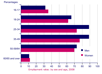
Employment rates of men and women by their age! interesting stuff, more women are only likely to be employed than men in the 65+ bracket.
Artist Collective based in leeds. Investigated self-sufficiency in the form of a DIY Survival Guide as part of the Art in Unusual Spaces programme in empty shops round leeds.
In their words:
"Gaze at A0 prints of crucial life-tips such as 'How to Make a Finger Puppet', 'How to be a Cheap Skate', 'How to Make a Sweet and Sour Stir-fry' and so forth. Leave empowered and ready to subvert the world."
Above are images from the presentation of the DIY Survival Kit at Leeds Students Union on 21st Nov 2009.
These are A0 prints, each describing something that can be done DIY for a self-sufficient life. Interesting stuff!
 7 inch pulpboard case, I designed and cut this out myself. Holds everything together very nicely. Will have a lovely screen print designed to cover both the front and back of the case.
 Flaps to contain contents in the case (screen printed side down in this image).
 Full contents!


 Above are images from the presentation of the DIY Survival Kit at Leeds Students Union on 21st Nov 2009.
